tOP CLASS
London-based creative studio Gilles & Cecilie create colourful, optimistic and inspiring Super Graphics and over the years they have collaborated with many schools to add colour and personality to their spaces.
In this presentation you can see work for Thomas Tallis, Willow Dene and Wingfield Schools all in London. Harestad and Tverlandet School in Norway.
In addition we present The Ulven Parade commissioned by OBOS for a new part of town in Oslo in which we did idea workshop with the local school Kuben at the beginning of the project.
Read article in Grafik Mag here and Creative Review here.
HOW WE WORK
The first part of the project is to establish a simple brief, a task or a problem to solve. In conversation with the school we ask questions about what type of artwork they imagine and where they would like it to be installed. We share our experience and propose what we can contribute with to build a better learning environment. In many of our projects we create a workshop with teachers and pupils where we involve them in the creative process that not only give insight in the profession of being a designer but also build ownership to the artwork. As designers we share the knowledge of communication, solving problems, making ideas ad concept as well as inspire and motivate with art and colour. The next phase is to research to create a foundation upon where the ideas and concepts are made. Our research is both writing text and image making. We present design directions an together we decide on the final choice. The outcome is very often large scale murals indoors and outdoors, sometimes installing prints and sometimes designing custom furniture. Our aim is to put creativity in the centre and to always think of new solutions that can make spaces special.
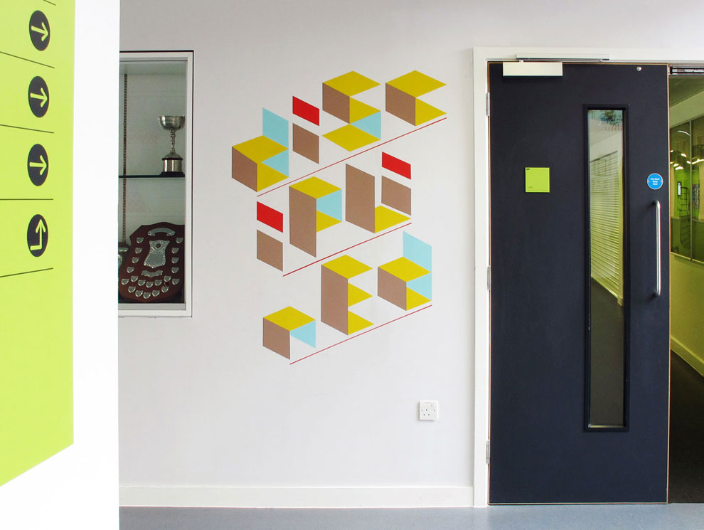
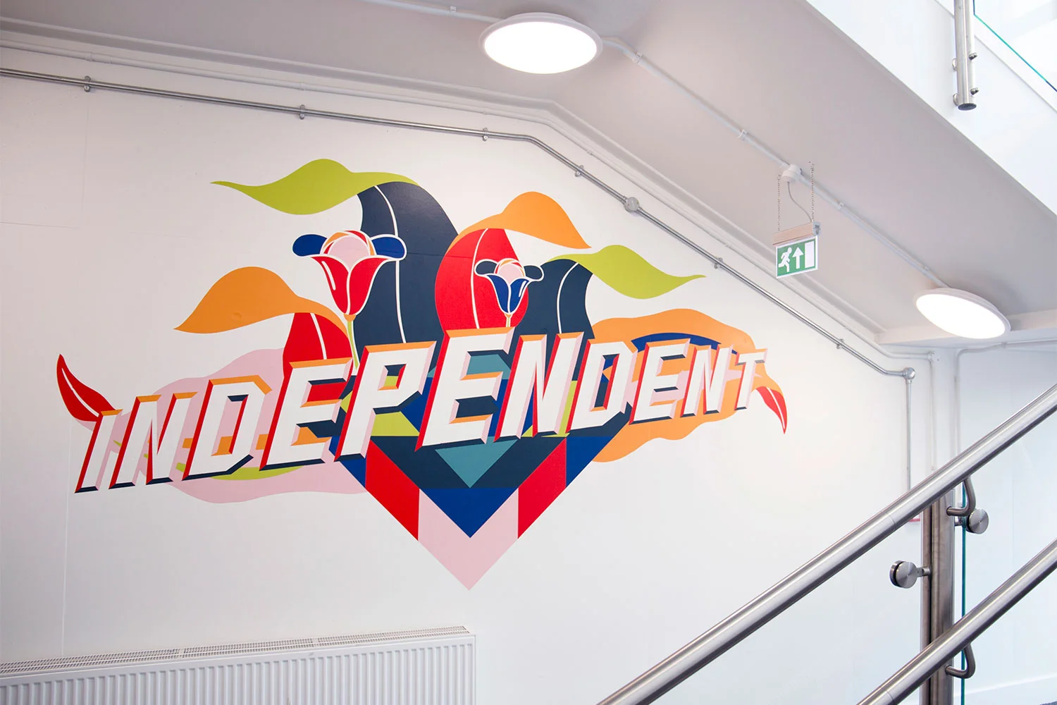
THOMAS TALLIS SCHOOL
We have been working with teachers and students at Thomas Tallis School in London to create a bright and friendly reception area for the newly built secondary school. Inspiration for the project has come from student workshops and the Year Seven design team’s drawings of remembered views from windows in their own homes, 1950s abstract textile patterns, modern book cover designs and Eighties Italian design movement the Memphis Group. We used paint and vinyl to apply pattern, welcoming messages and original drawings to the walls, windows and architectural elements, such as the columns of the exterior undercroft and indoor reception area. We designed new wooden seating and a reception desk clad in bold geometric patterns. The project was not only about redesigning a space, but also provided a learning experience for the students we worked with.

The process of making the typefaces started with research into signwriting, woodcut lettering and supergraphics. Then we started to sketch each word and to develop the personality of the lettering from the word’s meaning. For example, we made the word ‘inquisitive’ look as though someone was holding a magnifying glass over the middle part to illustrate its meaning. ‘Collaborative’ is put together from individual floating letterforms that are connected with arrows


Credits by Thomas Tallis School: We’re delighted with the finished designs – they’ve made the space much more welcoming and engaging. The furniture has been a particular talking point since it differs dramatically from the original reception desk. The new designs are quite playful and make a real statement when people enter the reception area, almost like pieces of sculpture. The ‘house’ seating and modular stools have been very positively received. They are functional, practical and decorative. The wall graphics are also great as they remind members of the community about our Tallis ‘Habits of Mind’ – Inquisitive, Collaborative, Persistent, Disciplined and Imaginative. They are slightly puzzling and it’s necessary for the viewer to solve the visual language of the design in order to read the word.

WINGFIELD SCHOOL
At Wingfield School we were collaborating directly with the headteacher that had a vision for this project to make the school more colourful and in the same time remind the staff and pupils about the schools values.

WILLOW DENE SCHOOL
Willow Dene School is a school for children with special needs in London. We worked with both of their schools located in Plumstead. We held workshops for the children where they contributed with making visuals and ideas to their schools value: Seeing Possibilities, Realising Dreams. In this presentation we include artwork ready for painting with measurements which is what we share with the school before it is installed.


TVERLANDET SKOLE
We were commissioned by SPINN architects in Norway to create an artwork for the facade of Tverlandet School. The wall is concrete and the technique applied is called graphic concrete. A technology that is printing your visual idea on a special membrane and transferring it to a concrete surface in the precast process. The letters of the school is made with symbols and illustrations that is specific to the culture in the vicinity: fishing, nature, sports, science and arts. Located just outside Bodø, north in Norway.


THE ALPHABET PROJECT
Artwork and identity for Randaberg Culture House and Harestad School outside Stavanger, Norway. Winning competition set by art organisation KORO we created wallpainting, plywood paintings, seating solutions, sound installation and more. At the start of the project we held a workshop with 15 year old pupils to come up with a sentence that use all the letters in the alphabet, a pangram.


THE Ulven Parade

Photo credit: Gilles Jourdan / Painting in the studio in Oslo
Ulven is currently one of Norways largest transformation project. New infrastructure, green areas, kindergardens, business premises and housing will be built over the next years.
The intention of OBOS is to create a modern and green part of town in contrast to the post industrial current state says the commissioner, Jon-Erik Lunøe. His ambition was to give soul and atmosphere to the environment during the building process.
Gilles & Cecilie did a short film to document the process from being in the studio to the physical installation. Some characters were also animated to bring the illustrations to life for digital surfaces.
The characters are fictional and made up with illustrated healthy food personalities and positive messages in a parade. The parade, installed onto a large building is marching happily together . The characters are the first inhabitants to move in to the Ulven area. The accompanying words are uplifting statements to bring positivity into the public realm.
The function of making large scale artwork available for the public is to inspire, give colour, create a landmark and attraction, a message that something is happening in this area.

Photo credit: Charlotte Wiig / Work in progress in the studio

Photo credit: Charlotte Wiig / Work in progress in the studio

Photo credit: Charlotte Wiig / Work in progress in the studio

Photo credit: Gilles Jourdan / The artwork installed at Ulven in Oslo